
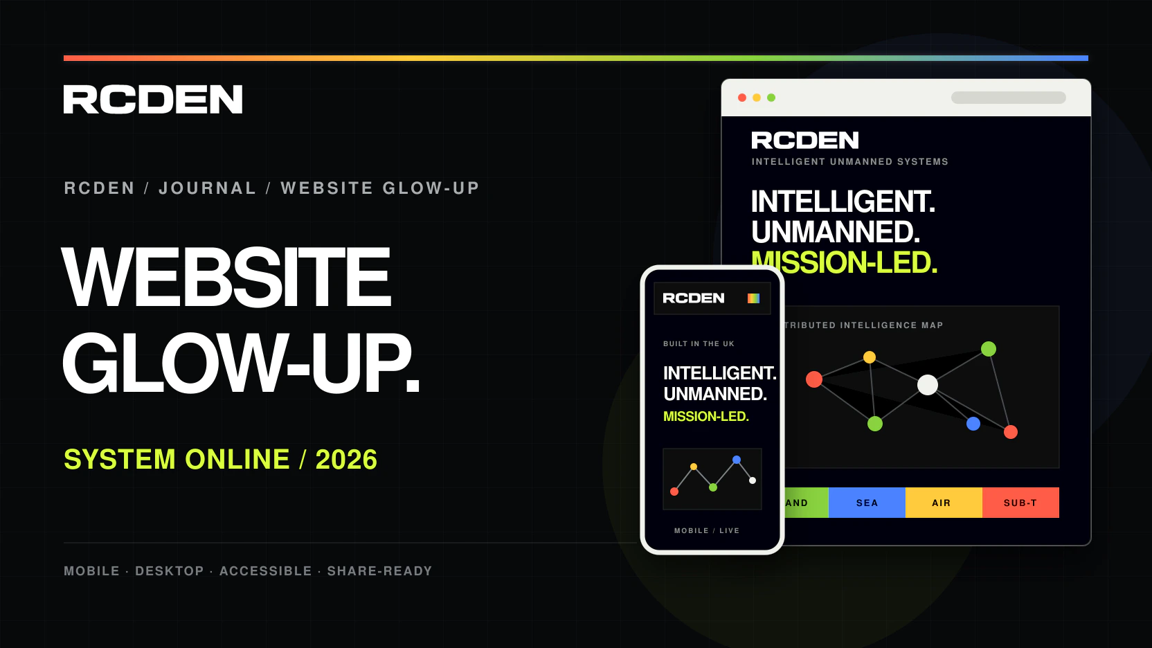
The new RCDEN website is live. This is more than a fresh coat of paint: the structure, mobile navigation, technical storytelling, Journal and social-sharing system have all been rebuilt around how people actually explore the company.
Expressing the RCDEN identity
RCDEN works across mechanical engineering, electronics, autonomy, software and mission integration. The website needed to communicate that range without turning into a wall of technical claims or a generic defence template.
The new visual language is deliberately controlled: high-contrast black and white, precise typography, CAD-led product imagery and four signal colours for land, sea, air and subterranean systems. Colour carries meaning; it is not added as decoration.
Clearer routes into systems, capabilities, governance and contact.
An interactive intelligence map connects sensing, decisions and action.
A compact sticky command menu keeps every section within reach.
Every Journal article now carries branded previews and direct sharing.
Website briefMake complex engineering clear enough to explore in seconds without making the capability underneath look simple.
The brain is the centrepiece
The interactive intelligence map is the clearest expression of the change. Instead of presenting autonomy as one mysterious box, it shows a network of sensing, communications, operator input, planning, assurance and platform control.
Visitors can move through the nodes and see how the parts connect. It looks technical because the work is technical, but the interaction keeps the explanation approachable on desktop and mobile.
Making articles easier to share
News should not stop at the edge of the website. Articles now include direct sharing for LinkedIn, Facebook, Instagram, WhatsApp, X and email, with a dedicated 16:9 image designed to travel with each link.
That gives every announcement a recognisable RCDEN presence when it is shared, while the article itself remains the single source for the full story, supporting material and official links.
Clear navigation and search information
The glow-up also improves the foundations: responsive layouts, accessible navigation, semantic page structure, article metadata, structured data, canonical links, a sitemap and optimised image formats. These do not promise rankings; they give search engines a cleaner, more accurate site to understand.
The result is a digital home that looks more like the company RCDEN is building: technically capable, direct, modular and made in the UK.
#050505#D9FF3F#8AD33F#4B83FF#FFCB3D#FF5C46Logo use, digital colours, typography, imagery, writing style and public-disclosure rules.
Move through the systems, open the intelligence map or start a conversation about a requirement.
Back to the homepage